Canadian Magazine Industry News
11 June 2013, TORONTO
Infographics that work: MagNet 2013 Recap
What is an infographic anyway, and how does one create one that is informative, yet eye-catching enough to grab the reader from the word 'go'?
This was the topic of discussion at the MagNet 2013 seminar 'Infographics That Work' with panelists Jack Dylan, senior art director at Corporate Knights, Colleen Nicholson, Canadian Family senior associate art director, and Jonathon Rivait, graphic artist for the National Post. Jessica Ross, tablet publishing manager, TC Media, moderated the session.
All three panelists displayed examples of graphics and explained the process behind the designs.
The panelists agreed that an infographic fails to work not just when it is inaccurate, but also when it is confusing for the reader. "Take the dry content…and use whatever visual queues you can to jazz it up," Dylan said.
This was the topic of discussion at the MagNet 2013 seminar 'Infographics That Work' with panelists Jack Dylan, senior art director at Corporate Knights, Colleen Nicholson, Canadian Family senior associate art director, and Jonathon Rivait, graphic artist for the National Post. Jessica Ross, tablet publishing manager, TC Media, moderated the session.
 |
|
From left to right: Jonathon Rivait, Colleen Nicholson and Jack Dylan.
|
"[Infographics] work as a gateway into a story. It can simplify information a reader can't get through text," Rivait said. "You can take a bigger issue and break it into smaller chunks. Sometimes you don't need too many words, you can use iconic images."
Rivait's work has won several Society of News Design (SND) awards, and his illustrations have contributed to the body work that put the National Post on the map as one of the World's Best Designed Newspapers according to the SND. For samples of the National Post's work throughout the years, visit the the paper's graphics vault.
 |
|
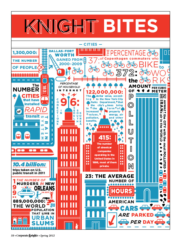
Corporate Knights cities infographic/Spring 2012 by Jack Dylan. Dylan's work has been featured in The Walrus, The Globe and Mail, Canadian Family and more.
|
All three panelists displayed examples of graphics and explained the process behind the designs.
The main points covered during the session were that the aim of any data visualization or graphic should be to tell a story first, that the information needs to be concise and easy for the reader to grasp, and that there is always a way to present lots of data in an interesting way.
"It helps to compress information on one page and make it more accessible," Nicholson said. "Find a way to make [data] more fun and use a new approach," she said, stressing the importance of communication between designers, writers and editors.
 |
|
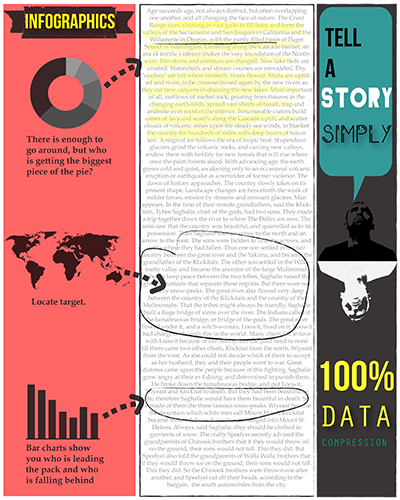
An infographic about infographics/ Sola DaSilva
|
The panelists agreed that an infographic fails to work not just when it is inaccurate, but also when it is confusing for the reader. "Take the dry content…and use whatever visual queues you can to jazz it up," Dylan said.
— Sola DaSilva
Comments (3) Post a Comment
Most Recent News Comment
| Jaded says: | |
Wow, Torstar really seems to be on a mission to bankrupt one magazine after another.... |
|
Most Recent Blog Comment
| Lorene Shyba says: | |
Full of terrific information, Thanks!... |
|
Most Read Stories