Canadian Magazine Industry News
3 October 2013, OTTAWA
Canadian Geographic adjusts course with new sections
The autumn issue of Canadian Geographic introduces new sections and design changes that were influenced by reader satisfaction surveys.
Features have been shortened from 10-12 pages to 6-8 pages, a greater emphasis has been placed on photography, and more interaction is being encouraged through new sections and multimedia icons directing readers to online content and social media.
"Our readers want more photography, cartography, illustrations and sharp stories they can easily digest, with a layout that's easy to navigate," said senior editor Aaron Kylie in a released statement.
New sections include Your Space, What's This? and Where's This?, which utilize audience engagement. The back page now features well-known Canadians, like The Amazing Race Canada's Jon Montgomery in the current issue, discussing their favourite destinations.
Creative director Suzanne Morin described the redesigned interior as having "a bolder, cleaner look." The mag's ITC Stone fonts have been swapped out for the Scela family. "It has a great combination of serif and sans serif. It's versatile, very readable, [and is] a very serious text font," Morin told Masthead.
Readers indicated dramatic changes to cover treatments and logo would not go over well, but small adjustments have been made. The logo has lost its 3D bevel edge for a crisper, "more modern" look according to Morin, and the maple leaf previously used to dot the letter 'i' in 'Geographic' has been changed to a compass to reflect the mag's connection with the Royal Canadian Geographical Society.
While the mag has undergone tweaks over the years, communications manager Deborah Chapman said this is the most significant rethinking of editorial and design since 1995.
Features have been shortened from 10-12 pages to 6-8 pages, a greater emphasis has been placed on photography, and more interaction is being encouraged through new sections and multimedia icons directing readers to online content and social media.
 |
|
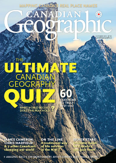
The redesigned autumn issue of Canadian Geographic is on sale now
|
"Our readers want more photography, cartography, illustrations and sharp stories they can easily digest, with a layout that's easy to navigate," said senior editor Aaron Kylie in a released statement.
New sections include Your Space, What's This? and Where's This?, which utilize audience engagement. The back page now features well-known Canadians, like The Amazing Race Canada's Jon Montgomery in the current issue, discussing their favourite destinations.
 |
|
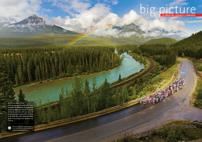
An interior spread shows a greater focus on photography
|
Creative director Suzanne Morin described the redesigned interior as having "a bolder, cleaner look." The mag's ITC Stone fonts have been swapped out for the Scela family. "It has a great combination of serif and sans serif. It's versatile, very readable, [and is] a very serious text font," Morin told Masthead.
Readers indicated dramatic changes to cover treatments and logo would not go over well, but small adjustments have been made. The logo has lost its 3D bevel edge for a crisper, "more modern" look according to Morin, and the maple leaf previously used to dot the letter 'i' in 'Geographic' has been changed to a compass to reflect the mag's connection with the Royal Canadian Geographical Society.
While the mag has undergone tweaks over the years, communications manager Deborah Chapman said this is the most significant rethinking of editorial and design since 1995.
Most Recent News Comment
| Jaded says: | |
Wow, Torstar really seems to be on a mission to bankrupt one magazine after another.... |
|
Most Recent Blog Comment
| Lorene Shyba says: | |
Full of terrific information, Thanks!... |
|
Most Read Stories


Masthead Web Edition Archives
More Archives
Another small point, Anon. 17: I received a health journalism award from the Canadian Institutes of Health Research to support writing The Walrus story and other articles about the benefits of walking, a program that specifies that "award recipients retain full journalistic independence and control of their stories." Call me naïve, but I think little things like this help people create content that actually engages audiences.
This isn't about the medium, it's about the basics of media... and the need to present information that will resonate with an audience. Good info may not connect with a reader if it is presented in a format that a reader doesn't want.
I'd rather applaud an attempt to engage an audience than spew venom about an attempt to evolve a publication. Not sure why some people want to find fault with a publication that's trying to stay afloat. Isn't that, ultimately, what all of us are trying to do? If we can't stay afloat financially, we cannot serve the audience we are trying to reach. And to stay afloat financially, we need to ensure that we are being picked up by readers. Not sure why that necessitates an attack by some.
(And no, I do not have any ties whatsoever with the magazine in question... I just don't like seeing us bash when we should be interested in seeing how these kinds of changes affect readership... if it strengthens the publication, I'm thinking we'll see more of these types of adjustments.)